Google Updates Iconic ‘G’ Logo After 10 Years with a Modern Gradient Look


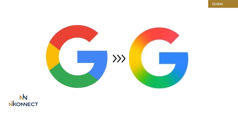
In a subtle yet impactful move, Google has redesigned its iconic “G” logo for the first time in a decade. The update reflects the tech giant’s commitment to innovation, modern aesthetics, and its deepening integration of artificial intelligence across its products.
A Fresh Look for a New Era
The most noticeable change in the new Google “G” logo is the shift from solid colors to a vibrant gradient. While it still features the familiar red, yellow, green, and blue palette, the new design blends these colors smoothly into one another, giving the logo a more dynamic and contemporary feel. This change is not just about appearance — it aligns with Google’s design philosophy in the age of AI, where adaptability, fluidity, and smart interfaces are key.
The Significance Behind the Logo Redesign
Google has long been known for minimalistic yet meaningful design changes, and the updated “G” logo is no exception. This new look symbolizes the company's transition into a more AI-focused era. It mirrors the visual language seen in recent products like Gemini, Google's AI assistant, and supports the brand’s evolving identity in a rapidly advancing digital world.
By refining its logo, Google aims to create a more cohesive user experience across its ecosystem. The gradient design ensures better adaptability to various screen types and digital environments, including app icons, smart devices, and AI-powered interfaces.
Where You Can See the New Logo
The updated “G” icon has already been rolled out to select users, particularly on the Google Search app for iOS and on Pixel devices. In the coming weeks, the redesigned logo is expected to appear across more platforms, including Android, Chrome, Gmail, Google Maps, and other key Google services.
Why This Matters for Users and Brands
Although the change may seem small, logo redesigns often signal broader shifts in a company’s direction. For Google, this marks a strategic branding decision that communicates its evolution beyond a search engine into a multi-dimensional, AI-powered technology leader. It also reinforces brand recognition while keeping the look fresh and future-ready.
Conclusion
Google’s redesigned “G” logo serves as a visual cue for what’s next — a more intelligent, connected, and design-forward ecosystem. As technology and user expectations evolve, so does Google’s identity, one gradient at a time.
Google G logo update, Google new logo 2025, Google logo redesign, Google gradient logo, Google logo change after 10 years, Google AI branding, modern Google icon, Google branding news, tech logo redesign, Google Pixel logo update.
Looking for the best business card printing and design in Dubai?
At nKonnect, we specialize in premium business card design and printing services tailored to make your brand stand out in the UAE market. Whether you need classic prints or NFC-enabled digital business cards, we offer fast, high-quality solutions for all your networking needs.But that’s not all — we’re also experts in custom logo design in Dubai, helping businesses build a strong visual identity. From Google review cards (NFC) and digital review stands to corporate profiles, trademark registration, business setup, visa services, professional translation, website design, and custom printing, we provide complete branding solutions under one roof. 📲 WhatsApp us at +971 50 157 9600 for top-tier business card printing and design in Dubai, custom logos, and all your branding essentials!


