The Psychology Behind Logo Shapes and What They Say About Your Brand
In a world where first impressions count more than ever, your logo is often the first handshake between your business and a potential customer. But beyond colors and fonts, there’s a subtle, powerful element at play — the shape of your logo.
Shapes aren’t just decorative. They communicate emotions, values, and intentions — all in a glance. Let's dive into the fascinating psychology behind logo shapes and what they silently say about your brand.
1. Circles, Ovals & Ellipses: Unity, Community, and Infinity
Brands that use circular shapes are often perceived as friendly, inclusive, and trustworthy. The continuous, unbroken form of a circle implies unity, eternity, and wholeness.
🟠 Common brand message: Harmony, care, and community.
🟠 Best for: Tech startups, wellness brands, NGOs.
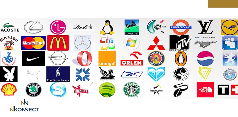
Examples: Pepsi, BMW, and Mastercard all use circular designs to create a feeling of openness and trust.
2. Squares & Rectangles: Stability, Strength, and Reliability
Straight-edged logos often give off a strong, dependable, and balanced vibe. Squares and rectangles symbolize structure, professionalism, and order.
🟦 Common brand message: Trust, authority, and efficiency.
🟦 Best for: Legal firms, financial institutions, corporate businesses.
Examples: Microsoft and BBC use structured shapes to suggest reliability and a no-nonsense approach.
3. Triangles: Power, Progress, and Direction
Triangles are dynamic. Point them upward and you suggest growth, progress, and ambition. Inverted triangles often indicate femininity or instability, depending on the context.
🔺 Common brand message: Innovation, direction, or cutting-edge thinking.
🔺 Best for: Tech firms, construction, energy, or even fashion.
Examples: Adidas and Delta Airlines utilize triangles to imply motion and aspiration.
4. Abstract or Organic Shapes: Creativity, Uniqueness, and Modernism
Some brands move away from geometric forms entirely, using fluid, freeform, or hand-drawn shapes to create an emotional or artistic connection.
🌿 Common brand message: Innovation, freedom, and creativity.
🌿 Best for: Artistic ventures, modern brands, startups seeking distinction.
Examples: Airbnb’s abstract "Bélo" symbol represents belonging in a creative, open form.
5. Lines: Motion, Energy, and Precision
Using horizontal, vertical, or diagonal lines can indicate movement, direction, or control.
➡️ Horizontal = Calm, relaxed
⬆️ Vertical = Strength, authority
↘️ Diagonal = Energy, motion
Lines are often incorporated subtly in wordmarks or icons to express speed, performance, or elegance.
Final Thoughts
Your logo shape isn’t just a stylistic decision. It’s a silent language that influences how people perceive your brand. When done right, it conveys your message before a single word is read.
At nKonnect, we don’t just design logos — we craft brand identities rooted in psychology, culture, and storytelling. If your logo isn't saying the right thing, maybe it's time to listen to what its shape is really communicating.
Need help with a powerful logo redesign or brand consultation?
📩 Contact Team nKonnect at www.nkonnect.me
Looking for the best logo design in Dubai, UAE? At nKonnect, we specialize in creating custom, high-quality logos that define your brand identity and leave a lasting impression. Alongside our expert logo design services, we offer a comprehensive range of branding solutions, including digital Google review cards NFC, digital business cards NFC, digital Google review stands NFC, corporate profile creation, trademark registration, business setup services, visa services, professional translation, website design, and printing services. With a commitment to excellence, innovation, and quick turnaround times, we ensure your business gets the professional edge it deserves. 📲 WhatsApp us at +971 50 157 9600 for the best logo design and all your branding needs in Dubai, UAE!
Get in touch
Address
Al Qiyada, Dubai
Contacts
+971 50 157 9600
info@nkonnect.me
✅ Best Logo Design in Dubai & UAE
✅ Best Flyer Design in Dubai & UAE
✅ Best Company Profile Design in Dubai & UAE
✅ Best Branding Services in Dubai & UAE
✅ Best Business Card Printing in Dubai & UAE
✅ Best Letterhead Printing in Dubai & UAE
✅ Best Flyer Printing in Dubai & UAE
✅ Best NFC Digital Business Card in Dubai & UAE
✅ Best NFC Digital Google Review Card in Dubai & UAE
✅ Best NFC Digtal Google Review Table Stand in Dubai & UAE
✅ Best NFC Stand in Dubai & UAE
✅ Best Trademark Registration in Dubai & UAE